Brand Colours for Your Business: How to Choose Them Step by Step
Colour is often the first thing people notice about a brand. This guide shows you how to pick colours that fit your business, work for Indian customers and stay the same on every screen, pack and board.
How do you choose brand colours for a business?
To choose brand colours for a business, start with your brand personality and your customers. Study the colours used in your industry, then pick one main colour, one or two supporting colours and an accent. Check contrast and cultural meaning, test the colours on real items like WhatsApp, packs and signboards, and record exact HEX and CMYK codes.
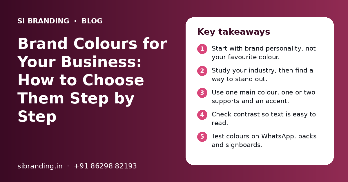
Key takeaways
- Start with brand personality, not your favourite colour.
- Study your industry, then find a way to stand out.
- Use one main colour, one or two supports and an accent.
- Check contrast so text is easy to read.
- Test colours on WhatsApp, packs and signboards.
- Write down HEX, RGB and CMYK codes for every colour.
Why do brand colours matter for a business?
Brand colours matter because people remember colour quickly, often before they read your name. The right colours make your business easy to spot, easy to trust and easy to remember.
Once your boards, packs and uniforms are printed, changing colours costs time and money. That is why it is worth following a clear process, which we explain below. Colour is one part of a wider brand identity, along with your logo, fonts and tone of voice.
How does brand personality guide your colour choice?
Your brand personality should guide your colours. First decide how you want people to feel about your business, then choose colours that match that feeling.
Write down three to five words that describe your brand. For example: calm, expert and caring for a clinic, or bold, young and fun for a snack brand. These words become your filter. Any colour that does not fit them is out.
| Brand personality | Colour direction to explore | Example businesses |
|---|---|---|
| Calm, trusted, expert | Deep blues, teals, soft greys | Clinics, CA firms, consultants |
| Fresh, natural, healthy | Greens, earthy browns, off-whites | Organic food, ayurveda, farms |
| Bold, young, energetic | Bright reds, oranges, strong yellows | Snacks, gyms, quick-service food |
| Premium, quiet, refined | Black, deep navy, muted golds | Jewellery, interiors, fashion |
| Warm, friendly, local | Warm oranges, mustard, terracotta | Restaurants, sweet shops, cafes |
| Creative, playful | Purples, pinks, mixed brights | Kids brands, events, design studios |
If you are not sure what your personality is yet, start with brand positioning. It is much easier to choose colours once you know who you serve and why they should choose you.
How do your industry and audience affect brand colours?
Your industry tells you what customers expect, and your audience tells you what they like. Good brand colours fit the industry enough to be trusted, but differ enough to be noticed.
Look at your competitors first
Collect the logos, boards, packs and Instagram pages of 8 to 10 competitors. Put them side by side on one sheet. You will quickly see the common colours in your field. If every competitor uses blue, a well-chosen different colour can help you stand out. But if you go too far from what your customers expect, they may not understand what you sell.
Think about who will see your brand
- Age: younger buyers may like brighter, bolder colours; older buyers may prefer calmer shades
- Location: a brand for a small town market may need different choices than a metro-only D2C brand
- Buying setting: a product on a crowded kirana shelf needs to be seen from a distance
- Channel: a brand that sells mostly on Instagram needs colours that look good on phone screens
What does colour mean in the Indian cultural context?
In India, many colours carry religious, festive or social meaning. Knowing these meanings helps you avoid sending the wrong message to your customers.
India is diverse, and meanings change between regions, communities and religions. So treat the points below as general awareness. Always check with people from your actual audience.
Saffron and orange
Linked with religion and spiritual life for many people. Works well for some brands, but use it with thought.
Red
Linked with weddings, festivals and good luck in many communities. Feels warm and festive.
Green
Linked with nature and freshness. On food packs, a green mark is also used to show vegetarian food.
White
Feels clean and simple. In some communities it is also linked with mourning, so avoid it as the only colour for festive products.
Yellow and gold
Often linked with festivals, prosperity and celebration, such as wedding and Diwali gifting.
How do you build a palette with primary, secondary and accent colours?
A good palette has one primary colour, one or two secondary colours, an accent colour and a set of neutrals. This gives you enough variety without losing a clear look.
| Role | What it does | Where it is used |
|---|---|---|
| Primary | The main colour people link with your brand | Logo, signboard, main buttons, packs |
| Secondary (1–2) | Supports the primary and adds variety | Backgrounds, sections, social posts |
| Accent | Draws attention to key actions | Offers, buttons, price tags, highlights |
| Neutrals | Keeps text easy to read | Body text, backgrounds, borders |
- 1
Pick the primary colour
Choose the one colour that best matches your personality words and stands out from competitors.
- 2
Add secondary colours
Pick one or two colours that look good with the primary, often lighter or darker shades or a nearby hue.
- 3
Choose an accent
Pick one strong colour that contrasts with the rest, and use it only for things you want people to notice.
- 4
Set your neutrals
Choose a dark text colour, a light background colour and one or two greys.
- 5
Decide the balance
Agree roughly how much of each colour to use, with the primary and neutrals doing most of the work.
Do not use too many colours. A palette with many equal colours looks messy and is hard to keep the same across vendors. If you have product lines, you can give each one its own colour, but keep the primary colour on every pack so the family stays linked. This is a common approach in packaging design.
How do you check contrast and readability?
Check that text stands out clearly from its background. Dark text on a light background, or light text on a dark background, is the safest choice.
Many colour pairs look nice but are hard to read. Yellow text on white, or red text on green, are common problems. Your phone number, prices and offers must be easy to read for everyone, including older customers and people with colour blindness.
- Use a free online contrast checker for every text and background pair
- Aim for at least a 4.5 to 1 contrast ratio for normal body text, which is the common web accessibility guideline
- Do not use colour alone to show meaning, such as red for sold out; add a word or icon too
- Avoid placing red and green next to each other for important information
- Print a test page in black and white to see if your design still works
- Check text on a phone in bright sunlight, where low contrast fails first
Good contrast also helps your logo. A logo should work in one colour, on dark and light backgrounds. Our logo design process tests this before the final files are made.
How should you test brand colours on WhatsApp, packaging and signage?
Test your colours on the real items customers will see before you print anything. Colours on a designer's screen can look very different on a phone, a printed box or a lit board.
| Where to test | What to check |
|---|---|
| WhatsApp profile and status | Is the logo clear in the round crop? Does it stand out in the chat list? |
| Instagram grid and reels | Do the colours look good together on a phone, in light and dark mode? |
| Website | Are buttons easy to see? Is the text easy to read on mobile? |
| Packaging | Does the colour print well on your box, pouch or label material? |
| Signboard | Is it readable from across the road, in daylight and at night? |
| Visiting cards and bills | Does it look right on paper, and in black and white printing? |
Printed colour depends on the paper, board or plastic, and on the printer. The same colour can look brighter on glossy paper and duller on plain kraft paper. Always ask your printer for a proof before a full print run.
For a fuller set of real-world checks, see our post on how to test a logo before launch. Most of the same tests work for colours too.
How do you document HEX, RGB, CMYK and Pantone codes?
Write down an exact code for every colour in every format your vendors use. Without codes, each printer, developer and designer will guess, and your brand will slowly change.
HEX
A six-character code like #1A2B3C, used for websites and digital design.
RGB
Red, green and blue values, used for screens, apps and videos.
CMYK
Cyan, magenta, yellow and black percentages, used for normal printing.
Pantone
A fixed spot colour system, useful when you need very exact colour on packs or signage.
Screens and printers make colour in different ways, so a HEX code and a CMYK code for the same colour will never match perfectly. Your designer should choose the closest CMYK and Pantone match for each colour, and test them in print.
Put all codes on one page in your brand guidelines. Add simple rules: which colour goes on which background, and which pairs to avoid. Share this page with every printer, developer and agency you work with.
What mistakes should you avoid when choosing brand colours?
The most common mistakes are picking colours by personal taste, copying a competitor, using too many colours and skipping real-world tests.
Do this
- Start with personality words and customers
- Look at competitors to find space to stand out
- Keep the palette small and clear
- Test on phones, packs and boards
- Record exact codes and share them
Avoid this
- Choosing the owner's favourite colour without a reason
- Copying the market leader's colours
- Following a trend that may look dated soon
- Using low-contrast text that is hard to read
- Letting each vendor pick their own shade
If your current colours have one of these problems, you do not always need to start again. Small fixes, like a stronger shade or a clear accent, can solve many issues. For bigger changes, a planned rebranding helps you move to new colours step by step, without confusing customers.
How can SI Branding help you choose brand colours?
We help you choose brand colours through a clear process: understand your business, study your market, create options, test them and hand over a documented palette.
Our team looks at your personality, customers, competitors and the places your brand will appear. We present a few palette options with reasons, test the chosen one on real items, and give you a colour page with HEX, RGB, CMYK and Pantone codes. Colour work can be done on its own or as part of a full visual identity project.
SI Branding is powered by Shivah Web Tech, with 11+ years of experience and 500+ projects. We work with businesses in India, the USA, the UK, Canada, the UAE and Australia. Cost depends on how many items and touchpoints we cover. You get a clear quote after a free call. To get started, contact us.
Frequently Asked Questions
How many colours should a brand have?
Most brands work well with one primary colour, one or two secondary colours, one accent colour and a few neutrals for text and backgrounds. This keeps the look clear and easy to repeat. Too many equal colours make designs look messy and make it hard for printers and designers to stay consistent.
Can I choose my favourite colour as my brand colour?
You can, but only if it also fits your brand personality, your customers and your industry. A colour you love may not send the right message to buyers. Test your favourite against two or three other options with real customers, and choose the one that best fits the business, not just personal taste.
What is the difference between HEX and CMYK codes?
HEX codes describe colour for screens, such as websites, apps and social media. CMYK codes describe colour for printing with cyan, magenta, yellow and black inks. Screens and printers create colour in different ways, so you need both codes for each brand colour. Your designer should pick the closest match and test it in print.
Should my brand colours be different from my competitors?
Usually yes, at least enough for customers to tell you apart. Look at the colours your competitors use and find space to stand out. But do not go so far that customers cannot tell what you sell. A different shade, a strong accent or a new pairing can be enough to be noticed.
Which colours should food brands in India be careful with?
Food brands should make sure their colours do not get confused with the green veg mark or the non-veg mark on packs. They should also think about cultural meanings, festival use and how colours look on the actual pack material. Testing the pack on a real shelf next to other products is very helpful.
Why do my brand colours look different on print and on screen?
Screens make colour with light, while printers use ink on paper or other material. The paper type, the ink and the printer all change how a colour looks. This is why you need separate codes for screen and print, and why you should always ask for a printed proof before a full print run.
Can I change my brand colours later?
Yes, but plan it carefully. Changing colours means updating your logo files, website, social pages, packs, boards and stationery. Many businesses change in stages, starting with digital items and then printed items as old stock runs out. Tell customers about the change so they still recognise you.
Talk to our team today
Call or WhatsApp +91 86298 82193. We reply fast, Monday to Friday.